Innogrid
Corporate Identity Design
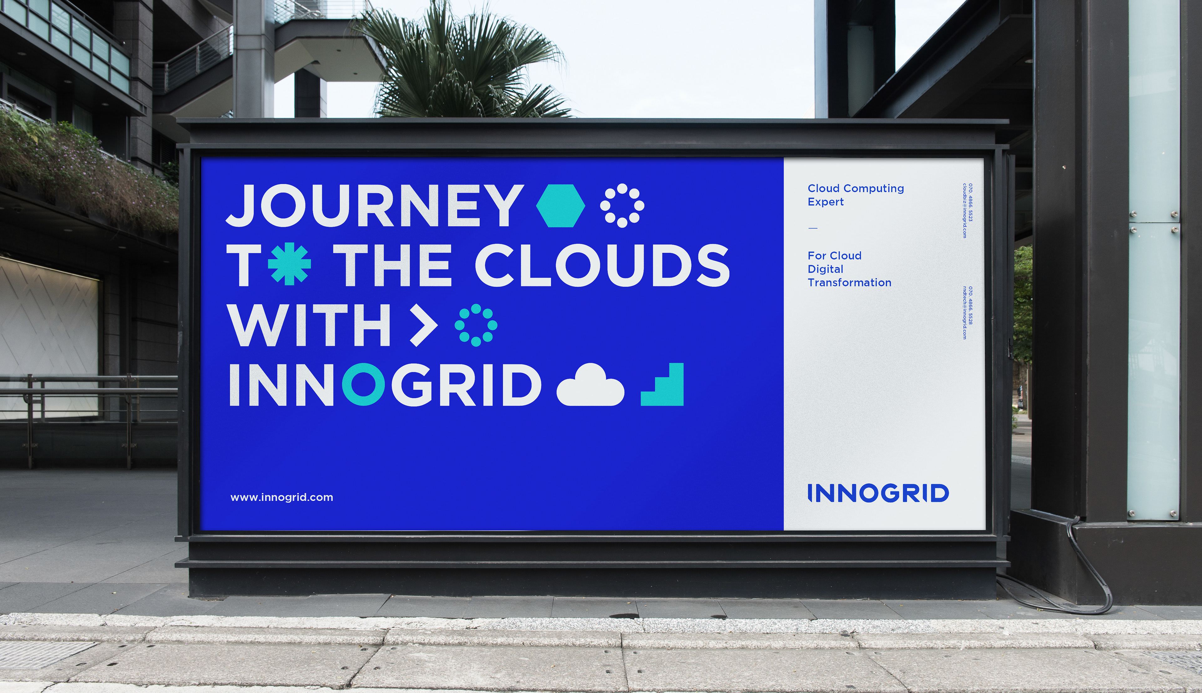
Innogrid is an IT corporation that offers a software platform for a cloud-based solution. The digital ecosystem is always rapidly evolving and the company wanted to position itself as an ICT professional who is able to create shared values in the market, based on expert skills related to the cloud and capacity-building. Part of this effort includes creating distinctive brand assets with the company's newly developed brand values. The word-type logo is marked by a simplicity that communicates precision and concision. The design also includes a motif with the smallest unit in the organization of a cloud-based solution, which functions as a dynamic and on-trend expression of the brand image.
2021
Branding, Graphic Design

logo type
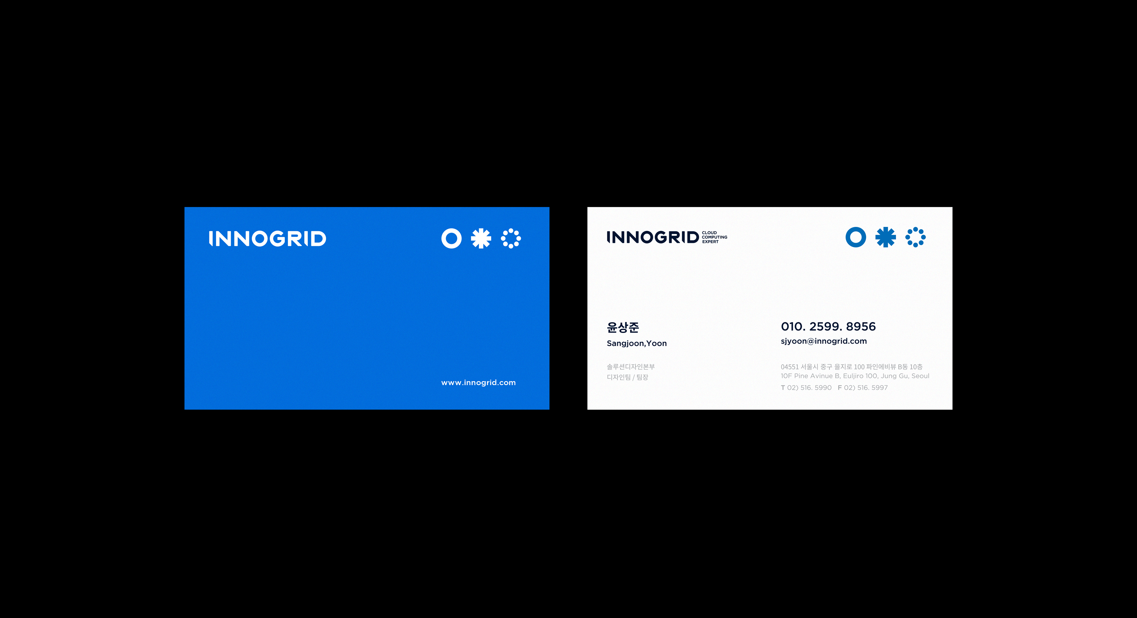
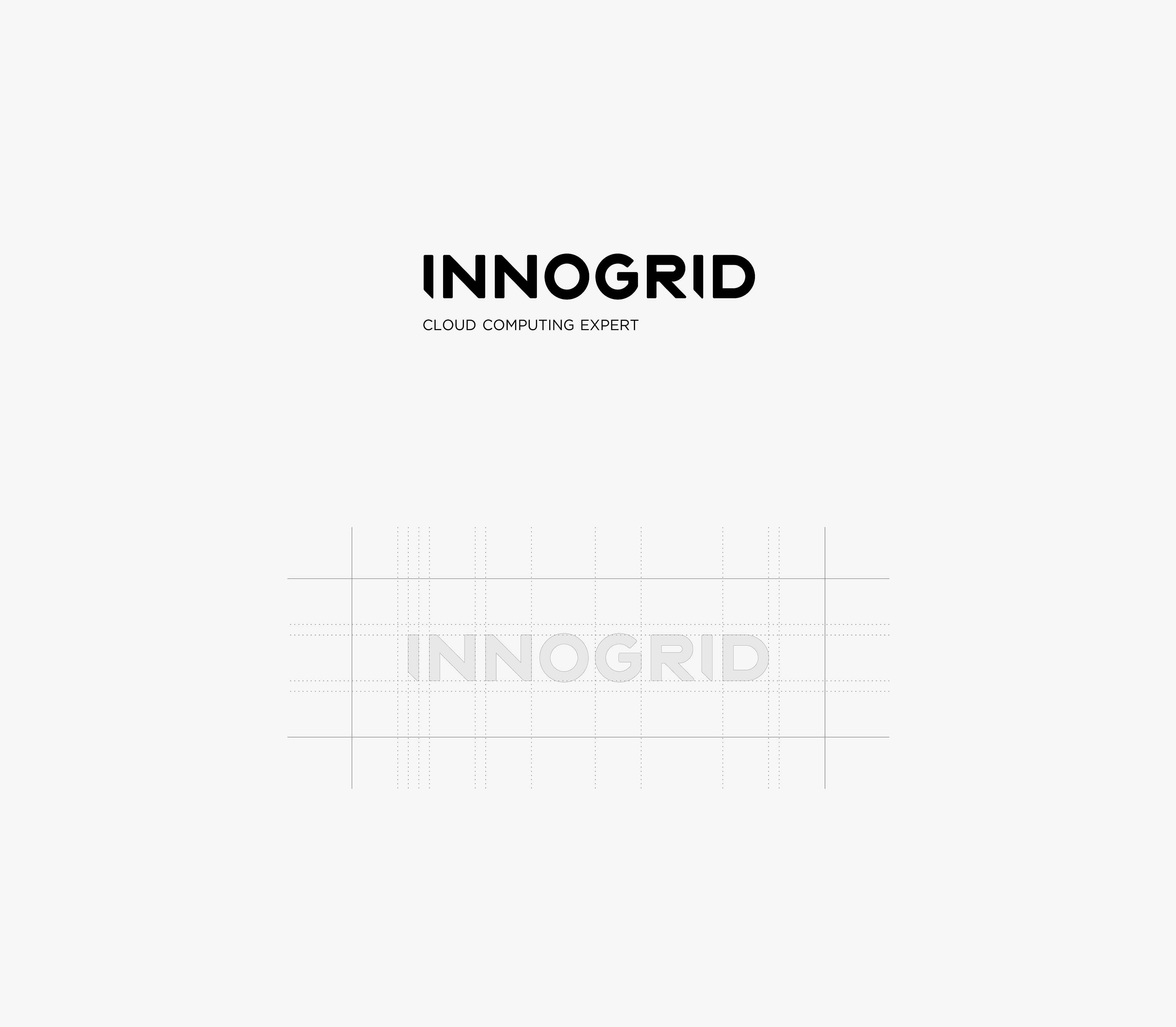
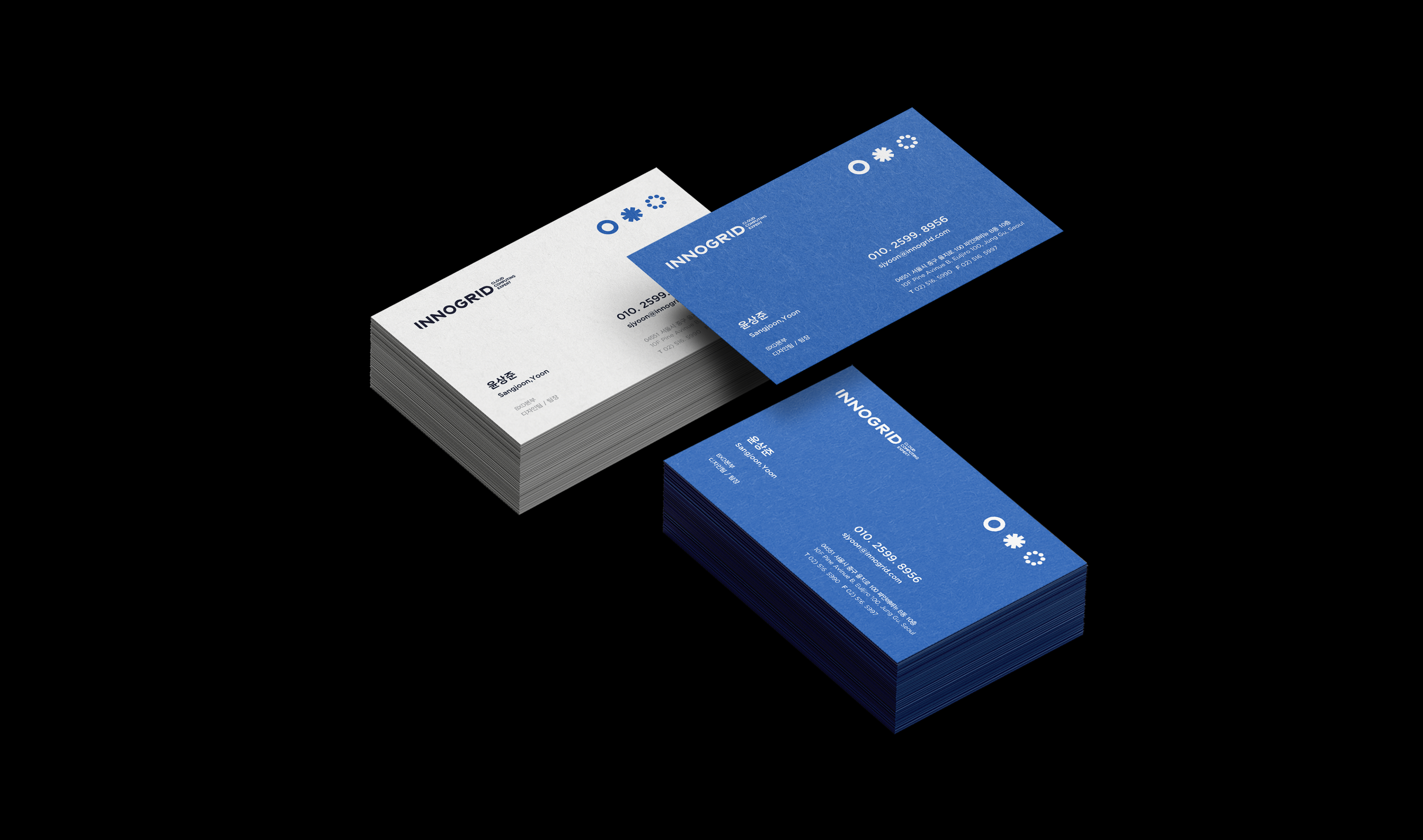
Innogrid’s wordmark is developed with considering the proportion between the space of types. Overall, we develop the logo as minimal word-type to reveal our concise and solid brand-image. Additionally, the unsharp edges of the words emphasize the flexibility of our brand. The harmony of straight lines and curved lines shows the visual stability, and the diagonal lines visually symbolize continuity, ascending, and progressive brand image.
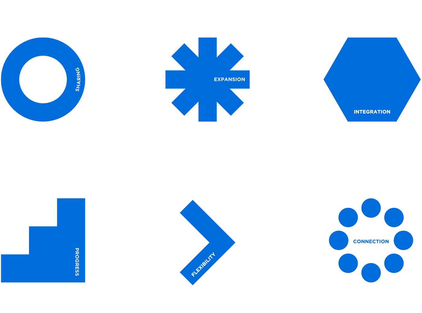
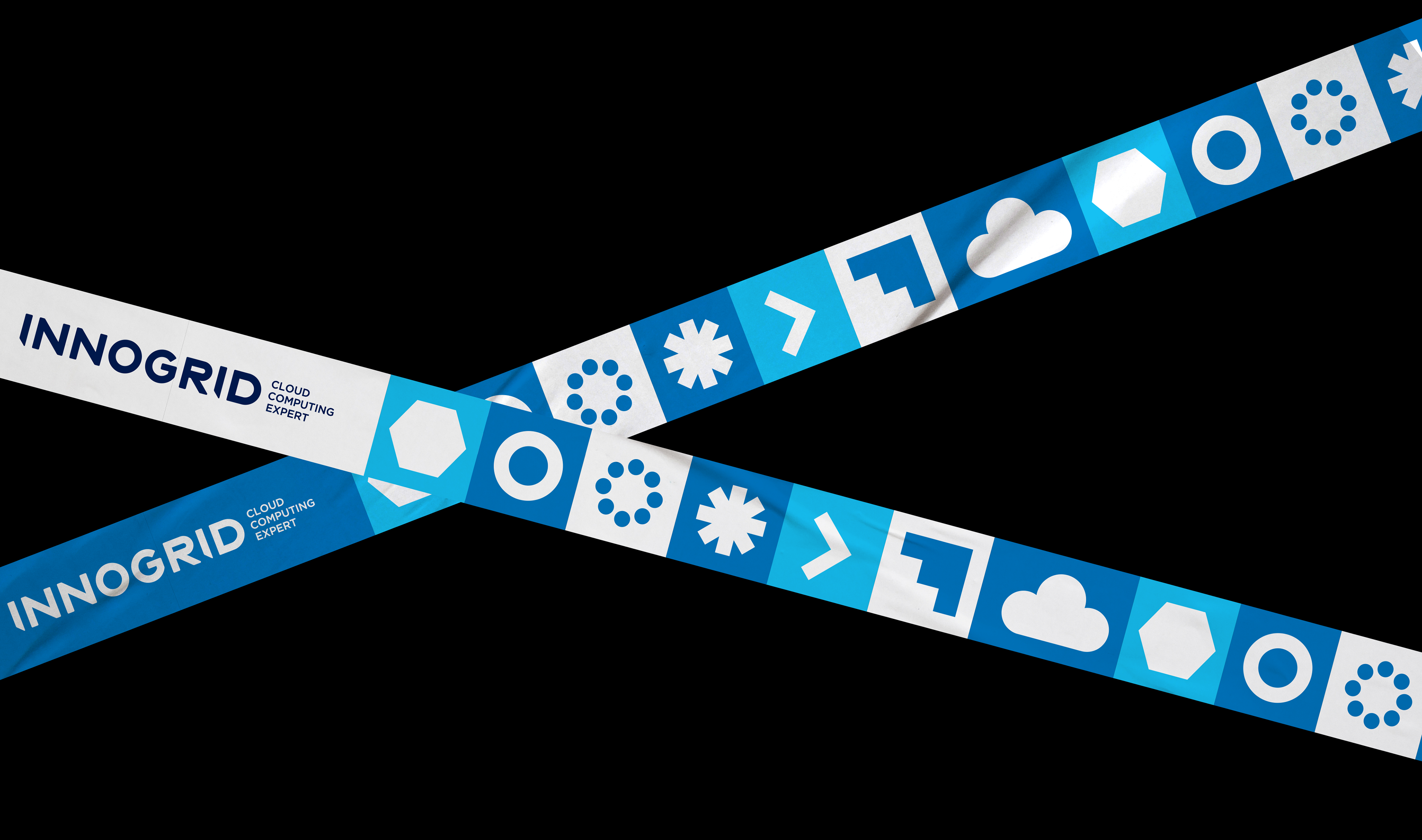
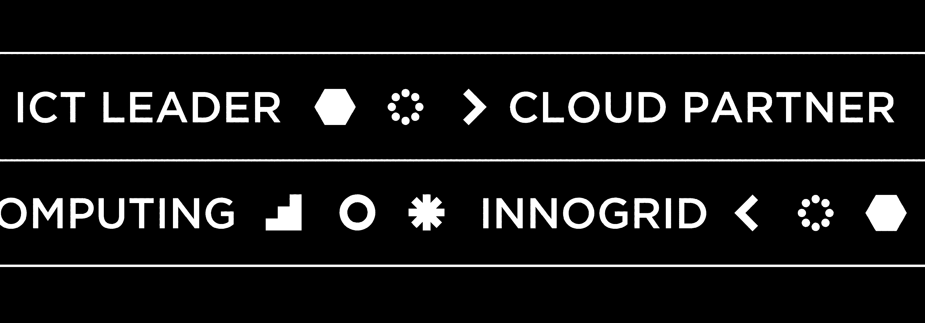
gRAPHIC mOTIF
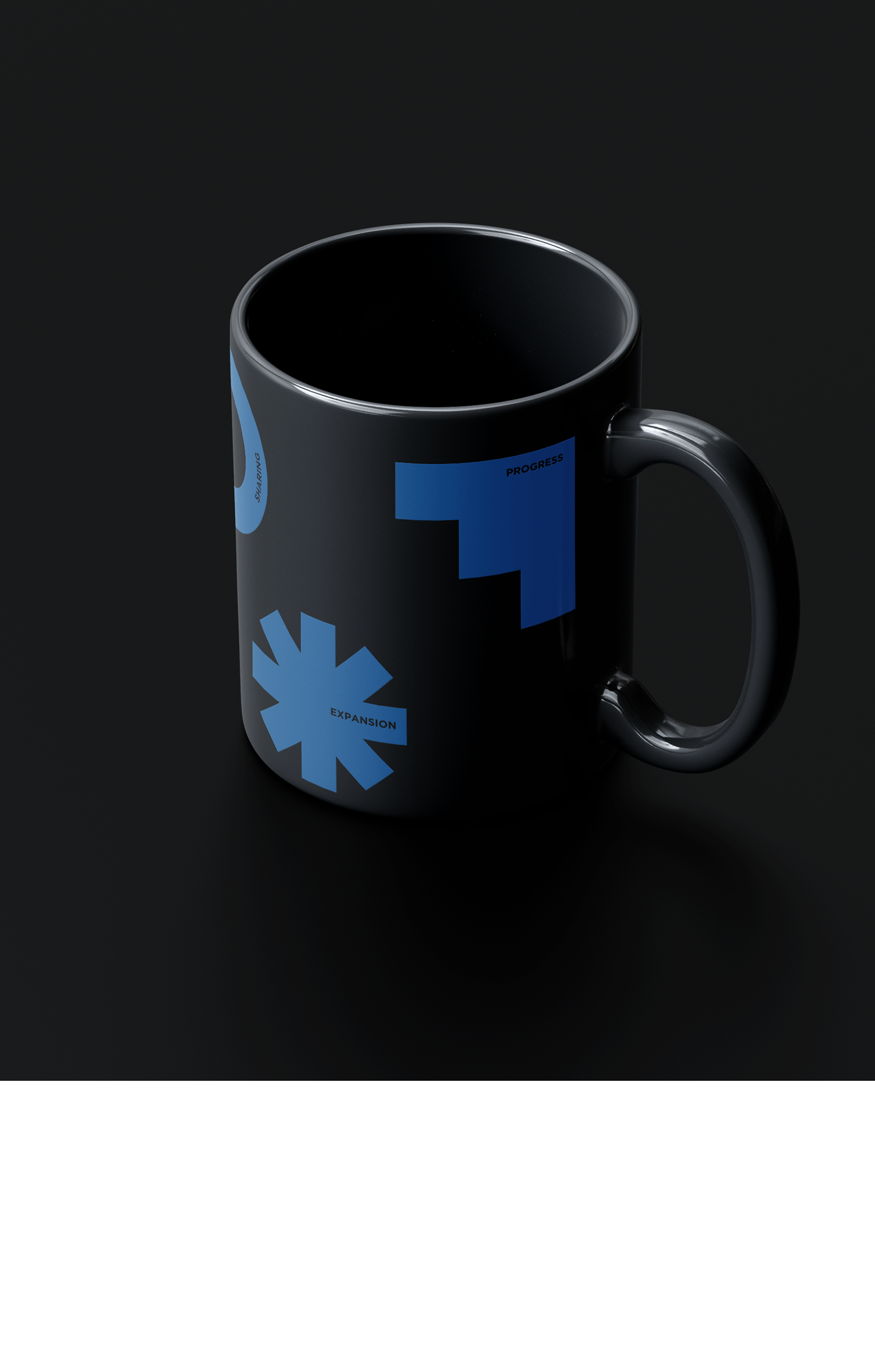
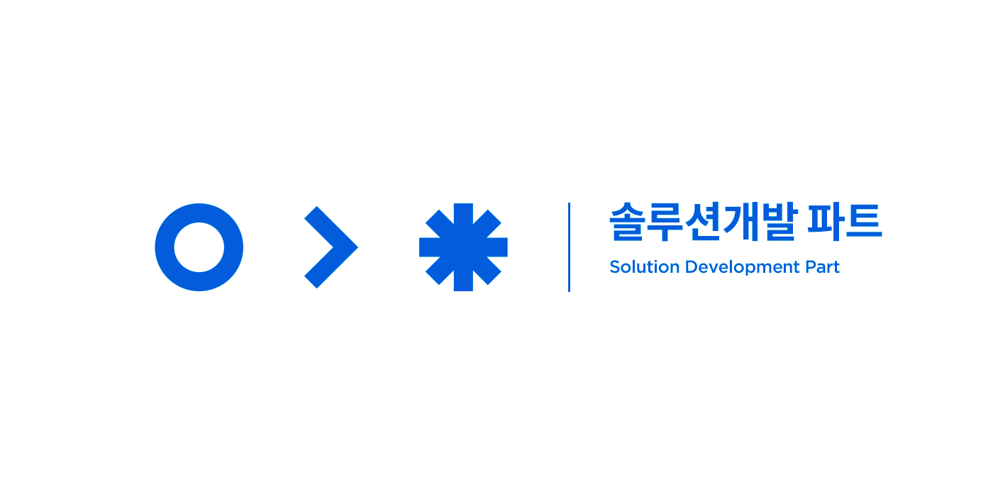
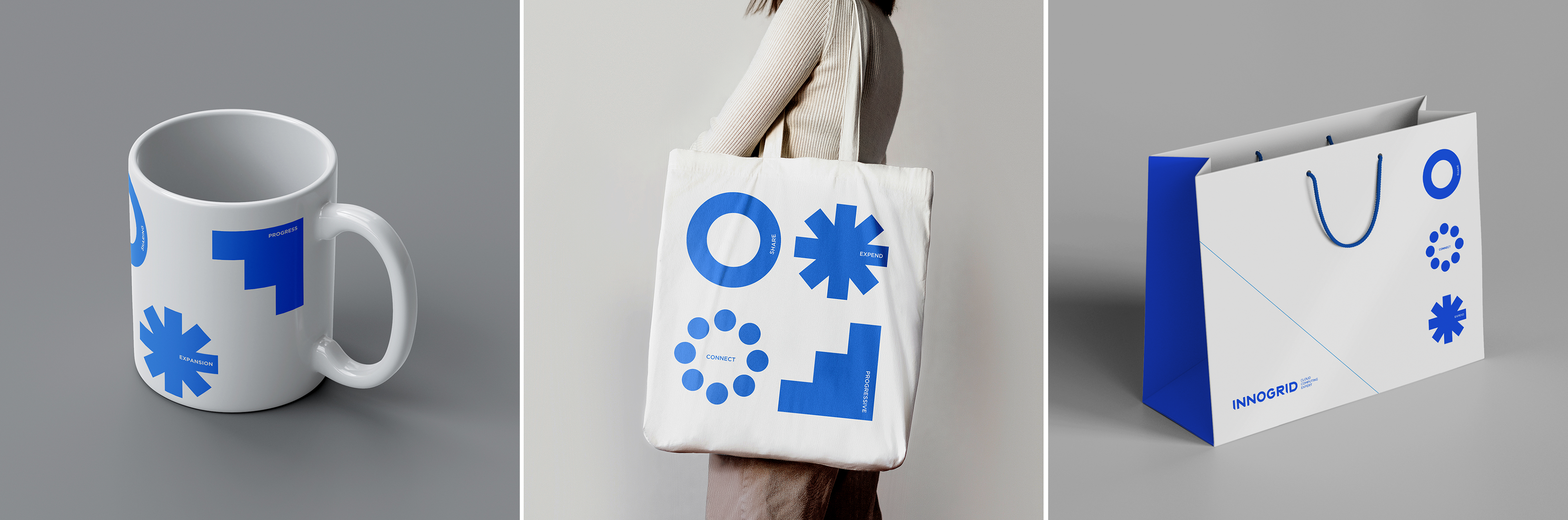
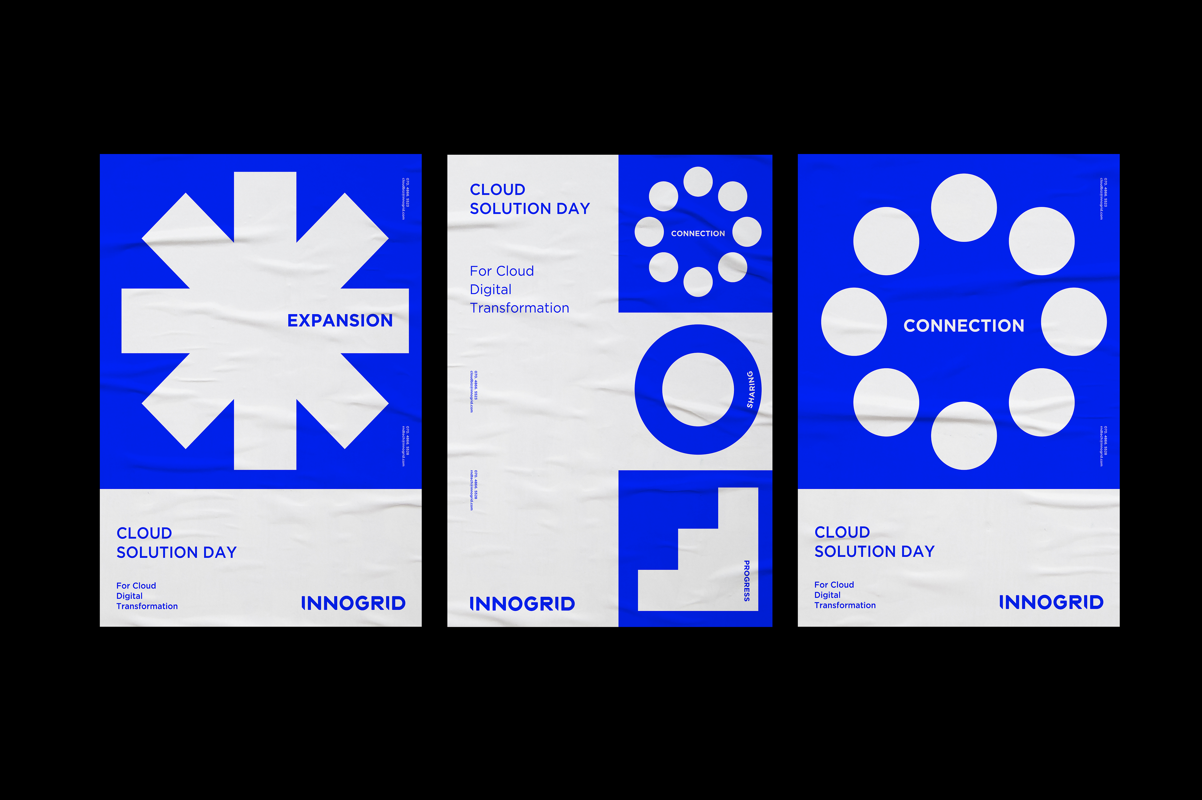
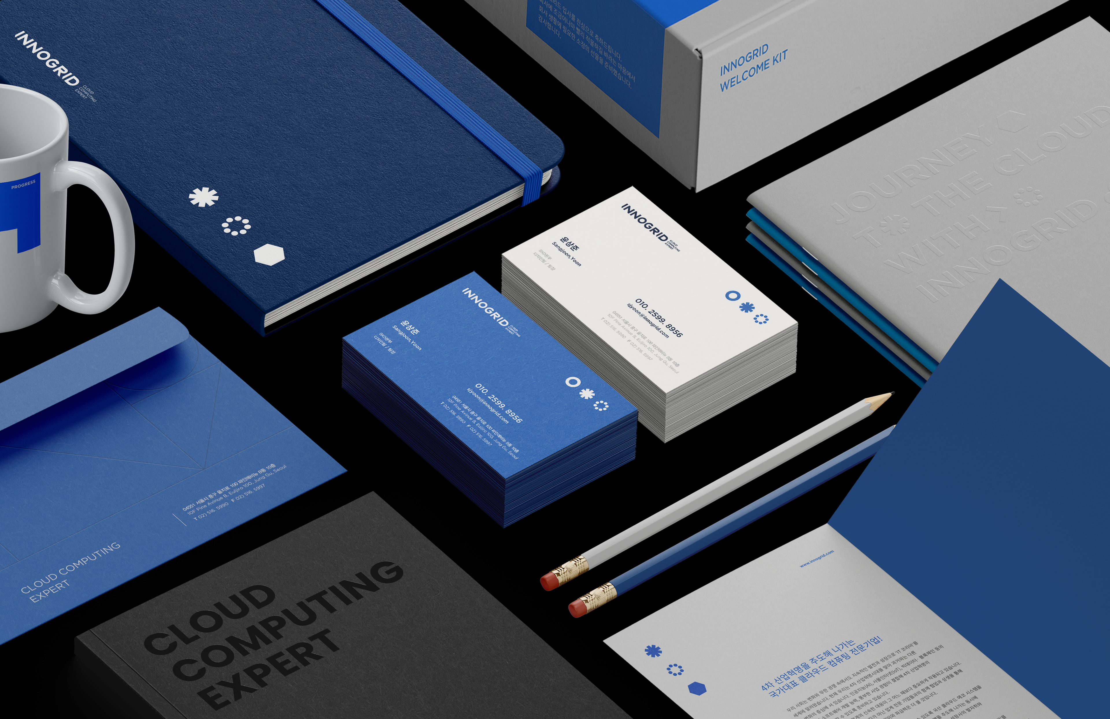
We create the graphic motive based on various keywords that organize our corporation, Innogrid. The simplified graphics symbolize the smallest unit that forms a cloud-based solution, and it indicates fundamental attitudes what our members must have. Different type of graphic combinations can represent our fundamental tasks and brand value.
The graphics, that represent Innogrid’s business goal by implication, play a subsidiary role to build our brand-image. The style of graphics can utilize in many ways, but we prefer that it should not be overused and only be used as a subsidiary role to build the brand-image.
The graphics, that represent Innogrid’s business goal by implication, play a subsidiary role to build our brand-image. The style of graphics can utilize in many ways, but we prefer that it should not be overused and only be used as a subsidiary role to build the brand-image.