INNOGRID SOLUTION BI DESIGN
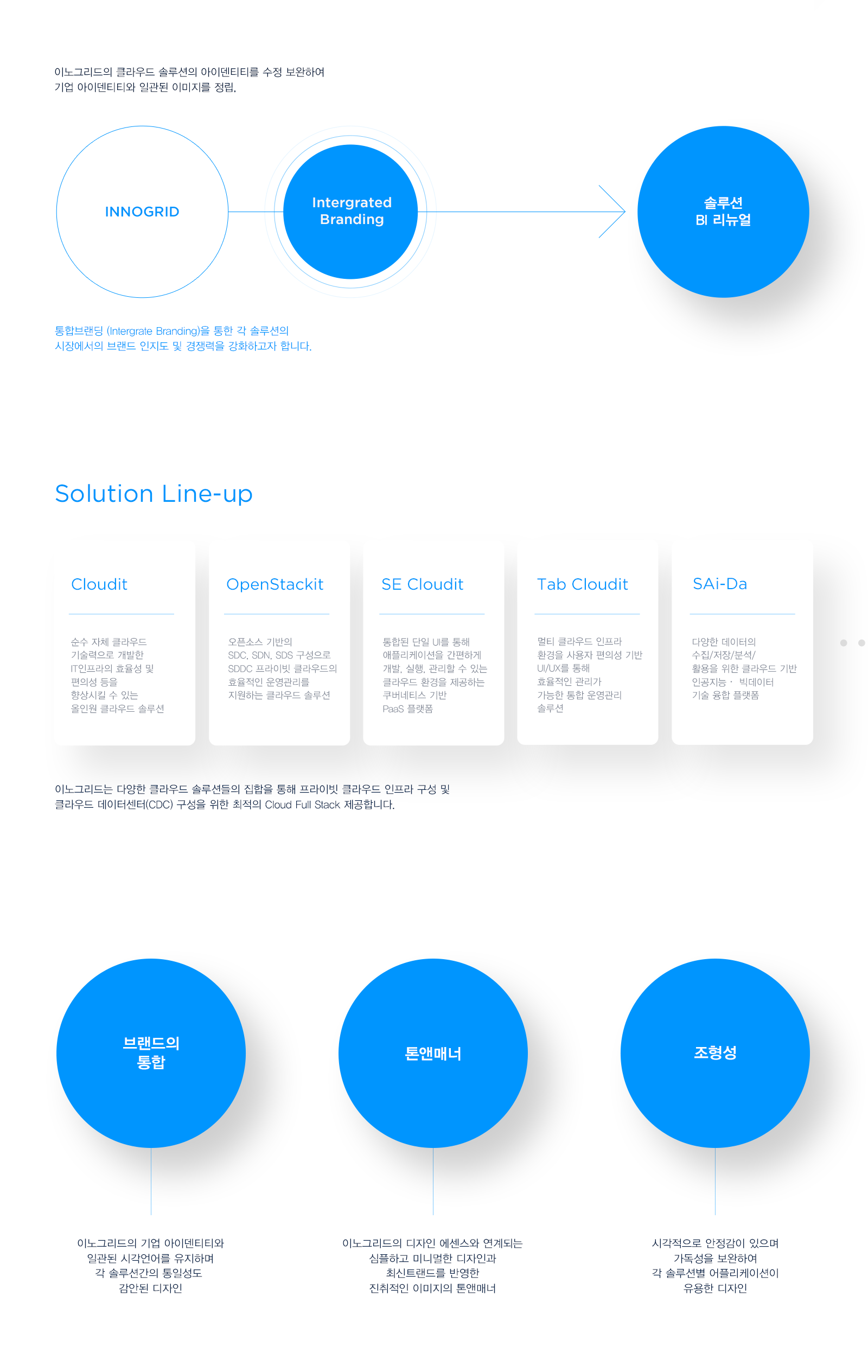
Innogrid's cloud solution identity is revised and supplemented to establish a consistent image with corporate identity, and to strengthen brand recognition and competitiveness of each solution in the market through integrated branding. By analyzing the current solution brand identity and establishing the renewal direction of the new identity, we tried to establish an integrated brand strategy with a flexible, intuitive, simple and minimal design language.
2021
Branding, Graphic Design
Branding, Graphic Design
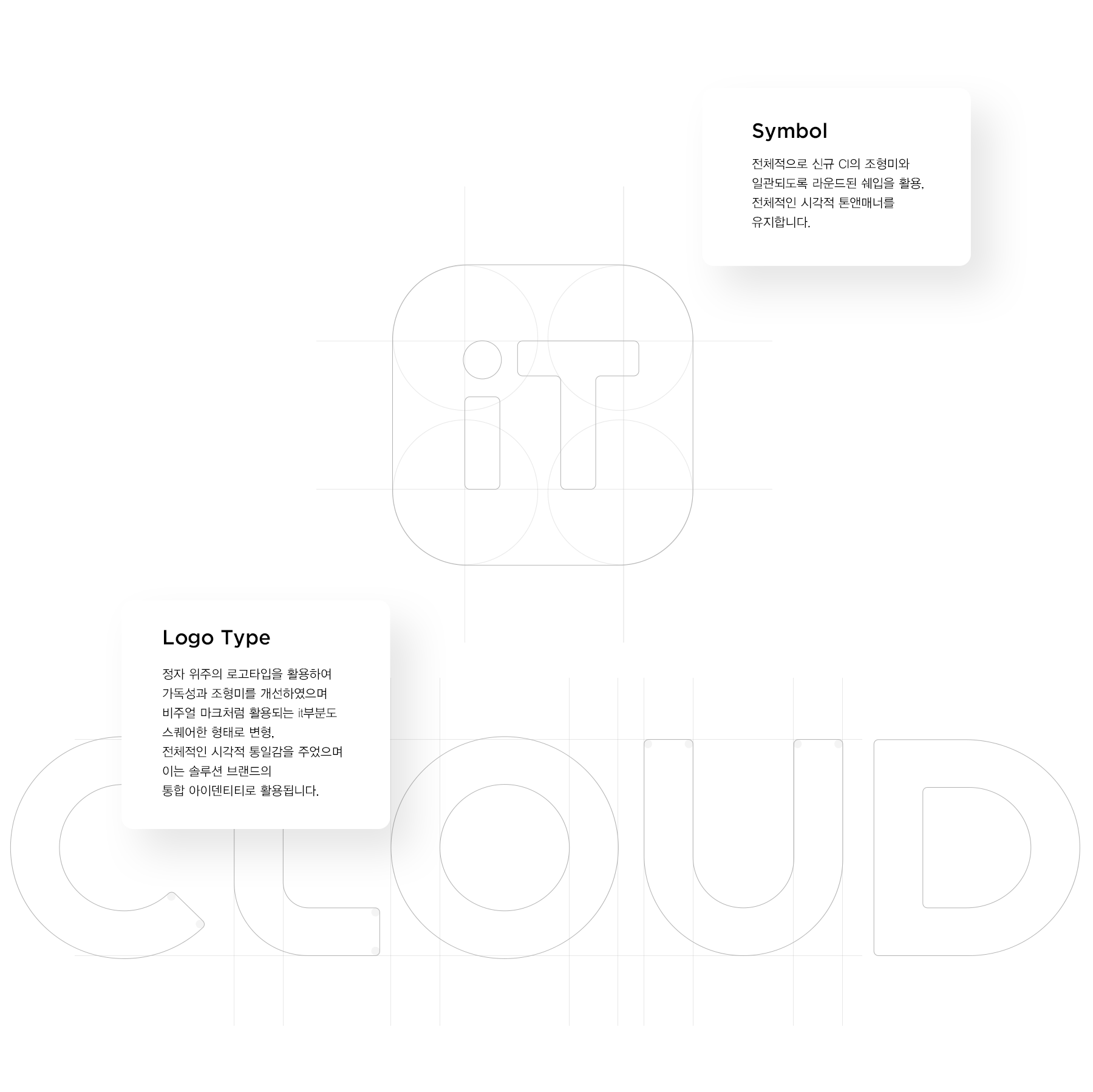

Design Guide
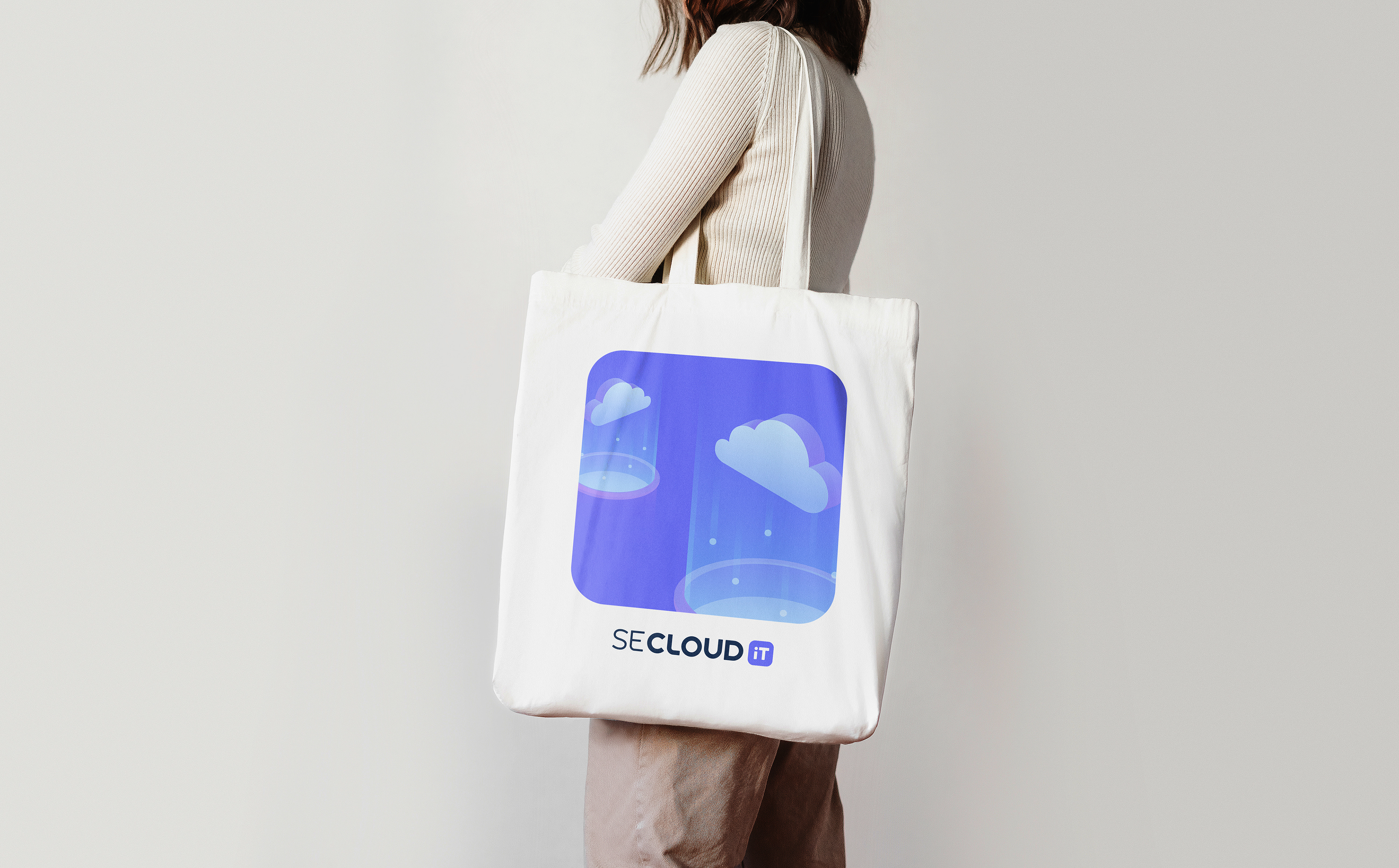
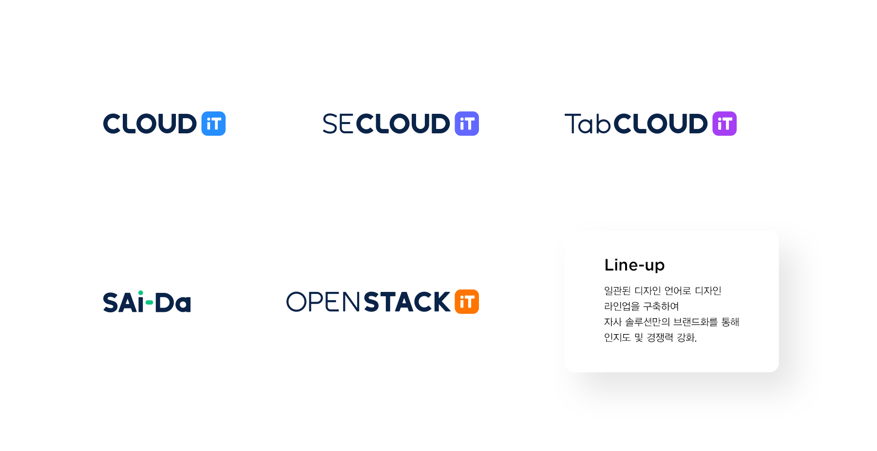
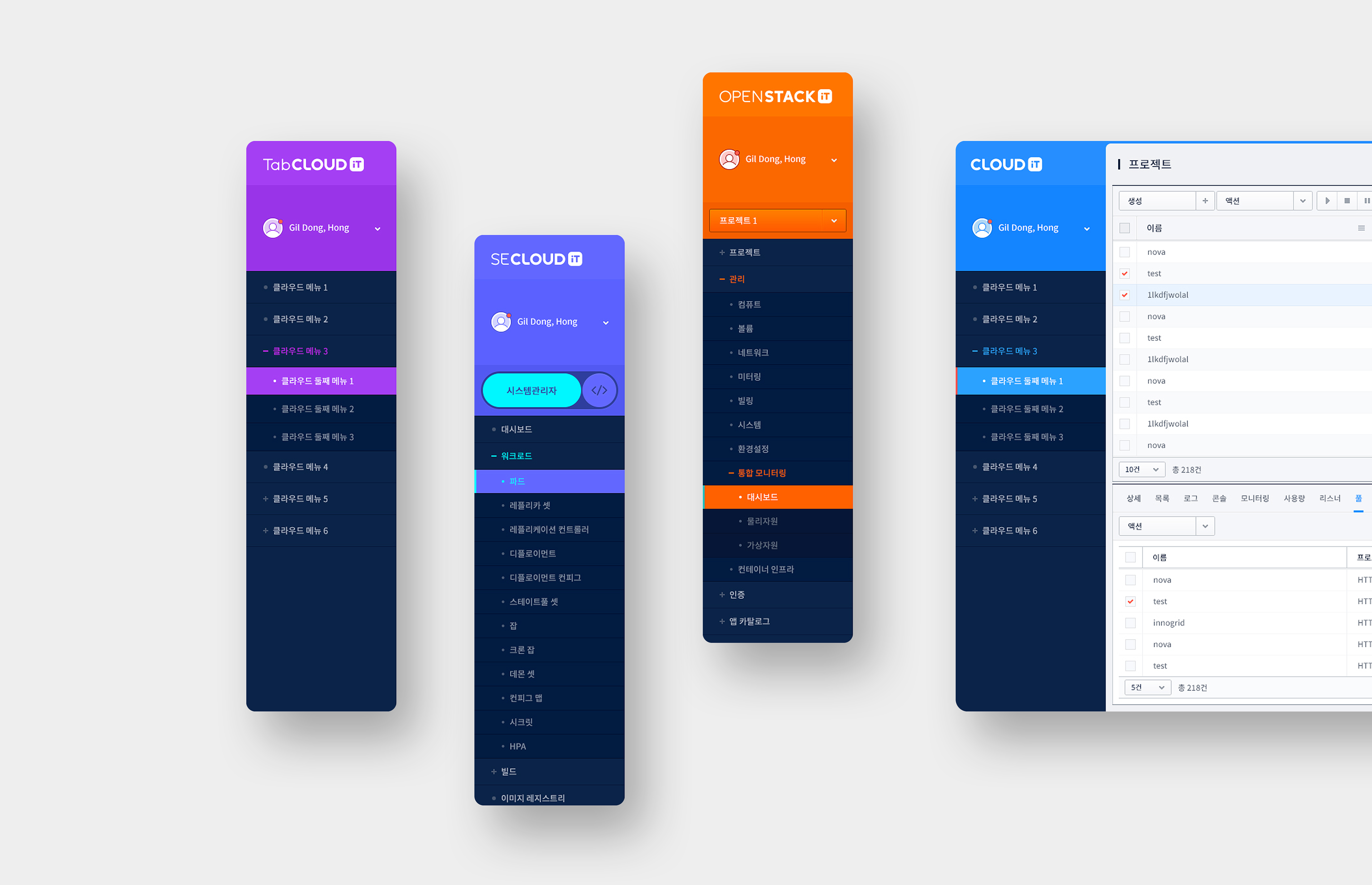
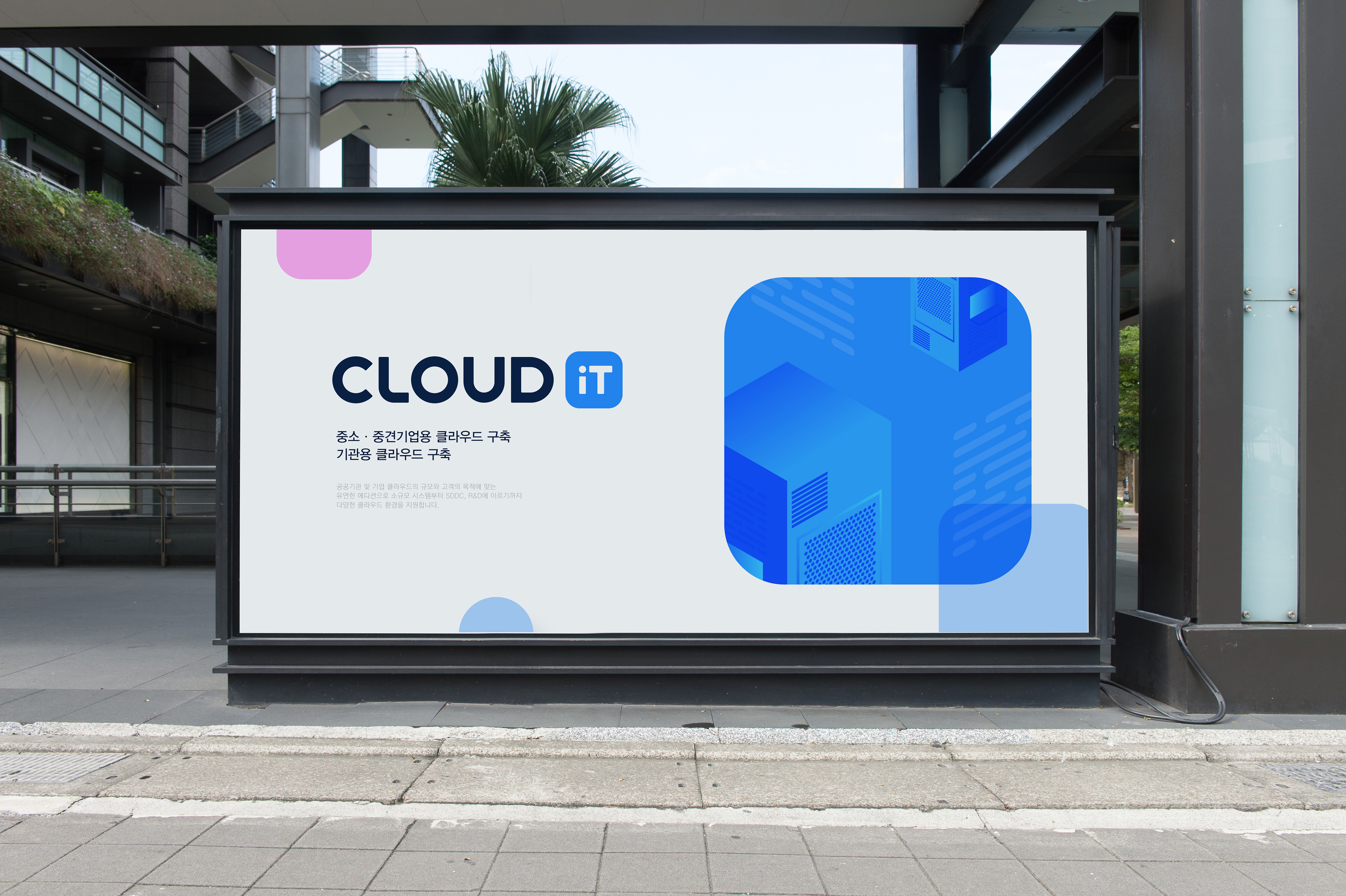
Overall, the overall visual tone and manner are maintained by using a slightly rounded shape to be consistent with the formative beauty of the new CI.In addition, by using the logotype centered on the pavilion, readability and formative beauty were improved, and the it part used as a visual mark was transformed into a square shape,It gave the overall visual unity, which is used as the unified identity of the solution brand.


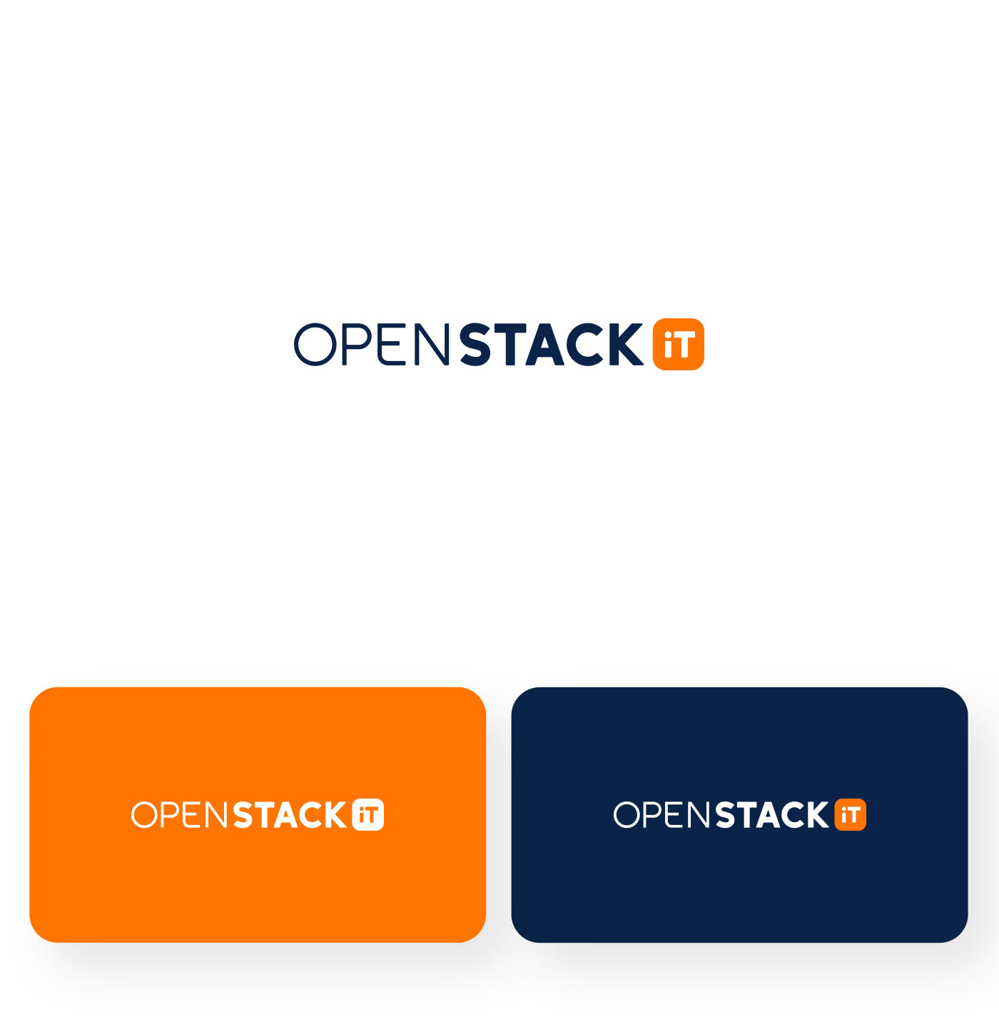
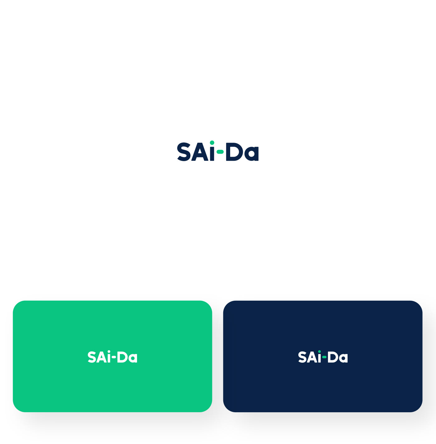

Color Guide
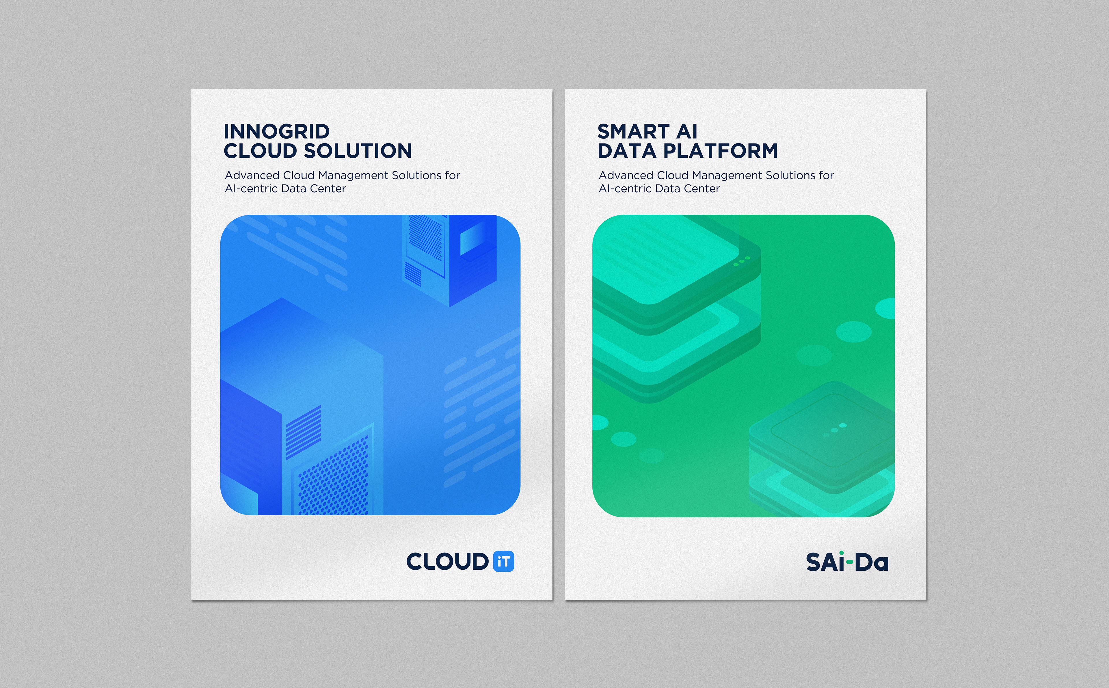
The color system specifies the color for each solution and is used as the identity of each solution.It builds an enterprising brand image and a youthful and trendy image by raising the saturation rather than the existing color.

gRAPHIC
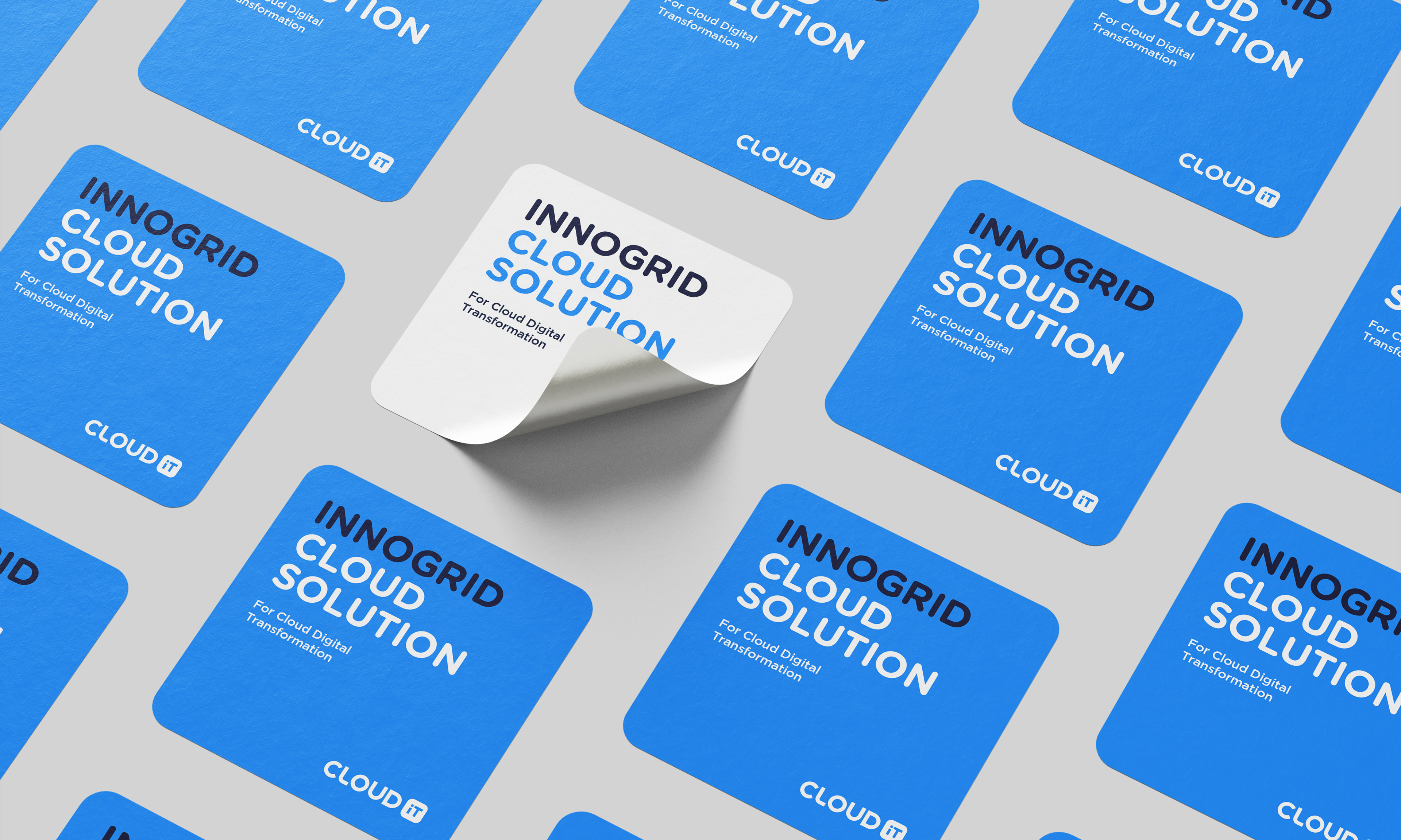
Various variations are possible with graphic design using the round square of the symbol.
It expresses a consistent visual identity.